NOTTSHC CDU data science team ggplot2 theme details
ds_theme.RdInspired from the chart layout used by TraffordDataLab https://github.com/traffordDataLab/assets/tree/master/theme/ggplot2
Examples
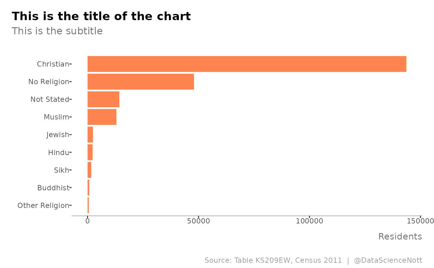
# load some data
df <- data.frame(
 religion = c("Christian", "Buddhist", "Hindu", "Jewish", "Muslim", "Sikh",
 "Other Religion", "No Religion", "Not Stated"),
 count = c(143639, 768, 2271, 2413, 12994, 1652, 566, 47968, 14307)
)

# create a ggplot object
plot <- df %>%
 dplyr::arrange(count) %>%
 dplyr::mutate(religion = factor(religion,
                                 levels = religion)) %>%
 ggplot2::ggplot(ggplot2::aes(religion, count)) +
 ggplot2::geom_col(fill = "#fc6721",
                   alpha = 0.8,
                   show.legend = FALSE) +
 ggplot2::coord_flip() +
 ggplot2::labs(x = NULL, y = "Residents",
               title = "This is the title of the chart",
               subtitle = "This is the subtitle",
               caption = "Source: Table KS209EW, Census 2011  |  @DataScienceNott")

# style with the ds_theme putting y axis label and ticks back
plot + nottshcMethods::ds_theme()