Plot a confusion matrix
plot_confusion_matrix.RdPlot a confusion matrix
plot_confusion_matrix(
  x,
  target_col_name,
  target_pred_col_name,
  type = "heatmap"
)
Arguments
| x | A data frame with two columns: the column with the actual classes; and the column with the predicted classes. Any other columns will be ignored. |
|---|---|
| target_col_name | A string with the column name of the target variable. |
| target_pred_col_name | A string with the column name of the predictions for the target variable. |
| type | A string indicating the of plot: "mosaic" or "heatmap". Defaults to- and currntly can only be- "heatmap". |
Value
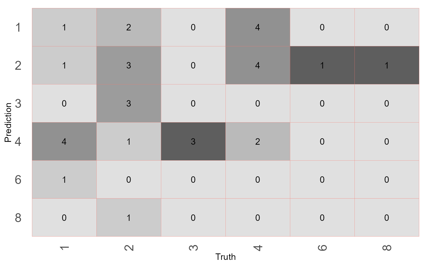
A ggplot (ggplot::geom_tile).
Details
This function differs from ggplot2::autoplot because the gradient
fills the heatmap (confusion matrix) based on absolute counts. It does
not make sense to compare colours between different "Truth" columns. By
contrast plot_confusion_matrix expresses column counts as proportions
of the total count in that column. The proportions are used to define a
colour scale. The actual counts are plotted though.
Examples
library(experienceAnalysis)
mtcars %>%
  dplyr::mutate(carb_pred = sample(carb, size = nrow(.))) %>%  # Mock predictions column
  plot_confusion_matrix(
    target_col_name = "carb",
    target_pred_col_name = "carb_pred"
  )
